In a culinary studio, composition begins before the tweezers appear. It begins with a relationship: something rich beside something sharp, a fragile surface above a soft centre, a familiar ingredient presented at an unfamiliar scale. The task is to make that relationship legible. Decoration asks what else might be added. Composition asks what the existing elements are doing together.
This distinction keeps experimental presentation grounded in eating. A photograph can reward an isolated dot of sauce or an elaborate tower. A diner may discover that the dot cannot be collected and the tower collapses before its flavours meet. A successful arrangement must work in both directions: it attracts attention from a distance and supports a satisfying sequence at close range.
Write a proposition you can test
Begin with one sentence. For example: “The first bite should combine a crisp edge, a creamy centre and a sharp finish.” This is more productive than choosing a fashionable plating style. It identifies a sensory relationship and gives the team something to evaluate. If the crisp element sits too far from the centre to combine naturally, the arrangement has contradicted the proposition.
Sketch three simple maps before using food. Mark the major component, the supporting component and the connective element. A sauce may be that connection, but so may a folded leaf or a repeated texture. Do not assume that everything needs to touch. Proximity, direction and repetition can suggest relationships without making the surface crowded.
Borrow a question, not a signature
Wassily Kandinsky’s Point and Line to Plane offers a vocabulary for visual tension, while Josef Albers’s Interaction of Color encourages attention to colour in context. Neither is a plating manual. Their usefulness lies in the questions they provoke: does a dark component feel heavier on this vessel? Does repetition establish rhythm, or merely multiply distractions?
Gestalt ideas such as proximity and similarity also provide a useful lens. Diners may read neighbouring elements as a group, although cultural habits and individual perception differ. Treat these principles as working hypotheses rather than universal instructions. Test them with people who have not watched the dish being assembled.
Publicly documented work by Michel Bras, particularly the changing vegetable composition associated with gargouillou, suggests how many elements can belong to a coherent idea. Massimo Bottura’s “Oops! I Dropped the Lemon Tart” offers another reference: apparent disorder can be intentionally composed. These examples are prompts for analysis, not templates to reproduce or evidence of private access.
Make a fair comparison
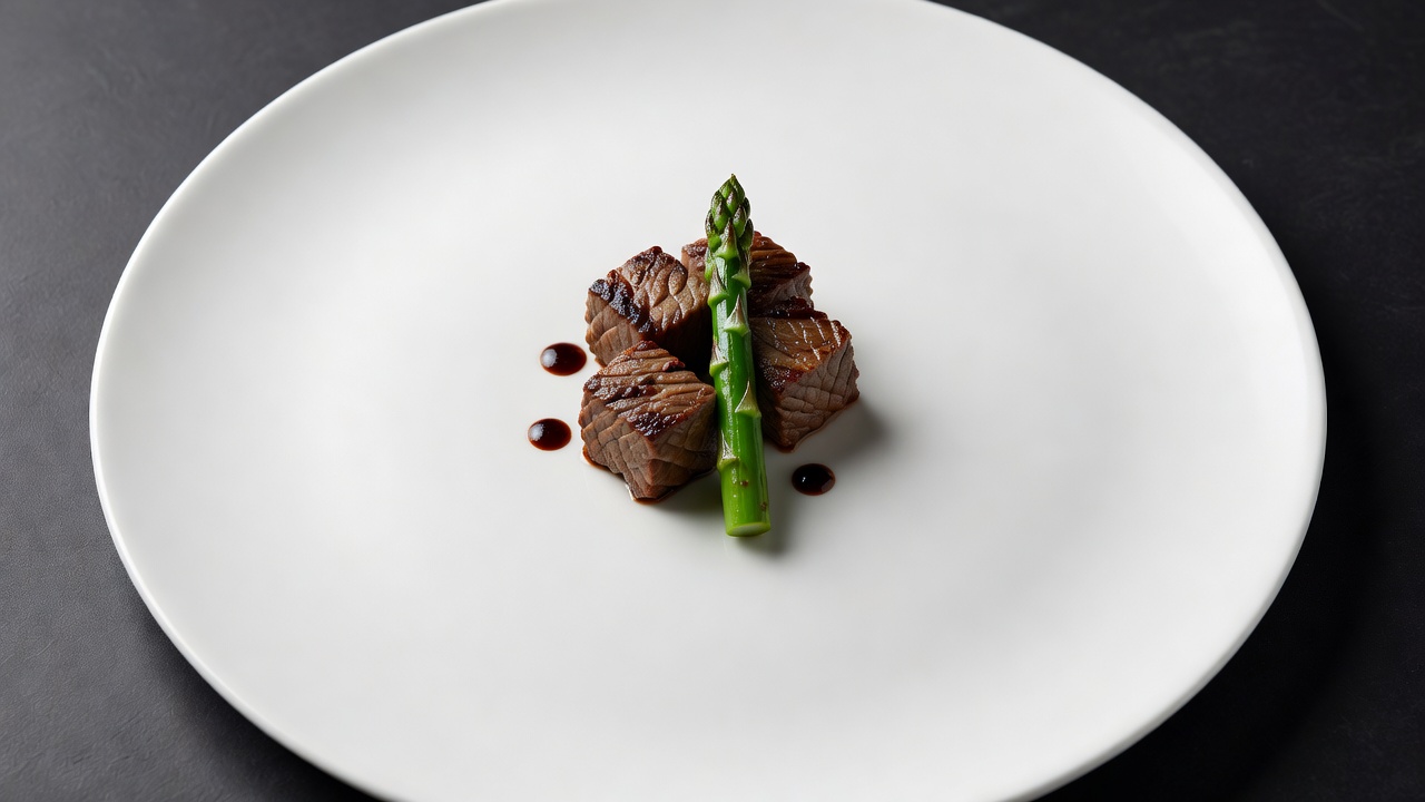
Use the same components and portion size for three trials. In the first, build a compact cluster. In the second, arrange a loose line. In the third, place the main grouping off-centre. Keep the vessel, lighting and viewing angle consistent. Otherwise, the most flattering photograph may win a comparison that was supposed to investigate composition.
- MapDraw the intended first bite.
- ArrangeChange placement, not ingredients.
- EatUse the actual service utensil.
- RecordNote friction as well as beauty.
Ask a tester where they would begin before giving any explanation. Then watch how they collect the elements. If they leave a carefully prepared component untouched, find out why. It may be visually disconnected, difficult to reach or mistaken for decoration. That is actionable information, not a failure of the diner’s sophistication.
Give empty space a job
Negative space can protect a focal point and allow the utensil to move. It can also exaggerate a small portion or create the impression that a dish is unfinished. Its value depends on the whole experience. Compare the occupied area with the vessel’s scale, the course’s role and the richness of the food rather than following a fixed percentage.
Colour needs the same discipline. A green accent should contribute flavour, aroma or texture, not simply rescue a beige photograph. Repetition can connect scattered components, but five repeated marks are not automatically more convincing than two. Remove one element and taste again. If the idea becomes clearer, subtraction has done real work.
Finish at the table, not the camera
Carry each version to a chair and view it from a seated position. A dramatic vertical feature may obscure the rest of the plate. A delicate arrangement may shift during ordinary movement. A rim that looks generous from above may leave little usable space for cutting. These discoveries belong in the composition record, not in a separate list of inconvenient exceptions.
Keep one photograph, one sketch and a short tasting note for each trial. Record the change and its consequence: “Closer grouping made the sharp element easier to include” is more useful than “Version two looked better.” Over time, these observations create a working design language specific to your food rather than a catalogue of borrowed gestures.
Reference shelf
- Wassily Kandinsky, Point and Line to Plane.
- Josef Albers, Interaction of Color; The Josef and Anni Albers Foundation.
- Michel Bras and Le Suquet, for publicly presented culinary work.
- Osteria Francescana, for the work of Massimo Bottura.